You have more data than ever, and somehow the answer you need is still three clicks, two filters, and one analyst request away. A chart helps only when someone has already built it, picked the right fields, and spotted the pattern worth showing you.
AI data visualization changes that order of work. Instead of you building the chart first and finding the insight later, AI reads the data, picks a fitting visual, highlights what changed, and explains it in plain language. You stay in charge of the decision. The machine does the digging.
In this guide, you will see how AI for data visualization actually works, what the latest research says about adoption and accuracy, where it still falls short, and what to look for when you compare AI data visualization tools.
What Is AI Data Visualization?
AI data visualization is the use of machine learning and large language models to turn raw business data into charts, highlights, and plain-language explanations with far less manual work. You describe what you want to know. The system finds the right fields, runs the calculation, chooses a chart, and tells you what it shows.
Here is how it differs from the charting you already know:
• Question first, chart second: Traditional tools expect you to pick a chart type and drag in fields. With data visualization using AI, you start with a business question and the visual follows.
• Explanation travels with the picture: Instead of leaving you to interpret a line, the tool adds a short summary of the trend, the outlier, or the change that matters.
• Follow-ups feel like a conversation: You can ask "why did this dip?" or "show it by region" without rebuilding anything, which is where most static dashboards fall short.
• The analyst's role shifts: Analysts spend less time on one-off chart requests and more time checking logic, defining metrics, and guiding decisions.
How Fast Enterprises Are Adopting AI for Data Analysis and Visualization
If it feels like every analytics conversation now includes AI, the numbers back you up. Adoption has moved well past the pilot stage.
• Organizational AI adoption reached 88% of surveyed organizations, according to the 2026 AI Index from Stanford HAI.
• AI deployment rates grew from two out of five organizations in 2024 to four out of five, according to Gartner analysts speaking at the firm's 2026 Data & Analytics Summit.
• A Gartner survey of 353 data, analytics, and AI leaders, run in November and December 2025, found only 44% of organizations have adopted financial guardrails or AI FinOps practices, so spending discipline is lagging behind usage.
• Over 50% of analytics and AI leaders say their organizations already use AI tools for automated insights and natural language queries, per a separate Gartner survey of 403 leaders.
• Gartner also predicts that 75% of new analytics content will be contextualized for intelligent applications through generative AI by 2027.
The takeaway for you: AI-generated charts and insights are quickly becoming the default way people expect to consume data, which puts real pressure on self-service analytics programs to keep up.
How AI Turns Business Data Into Actionable Insights
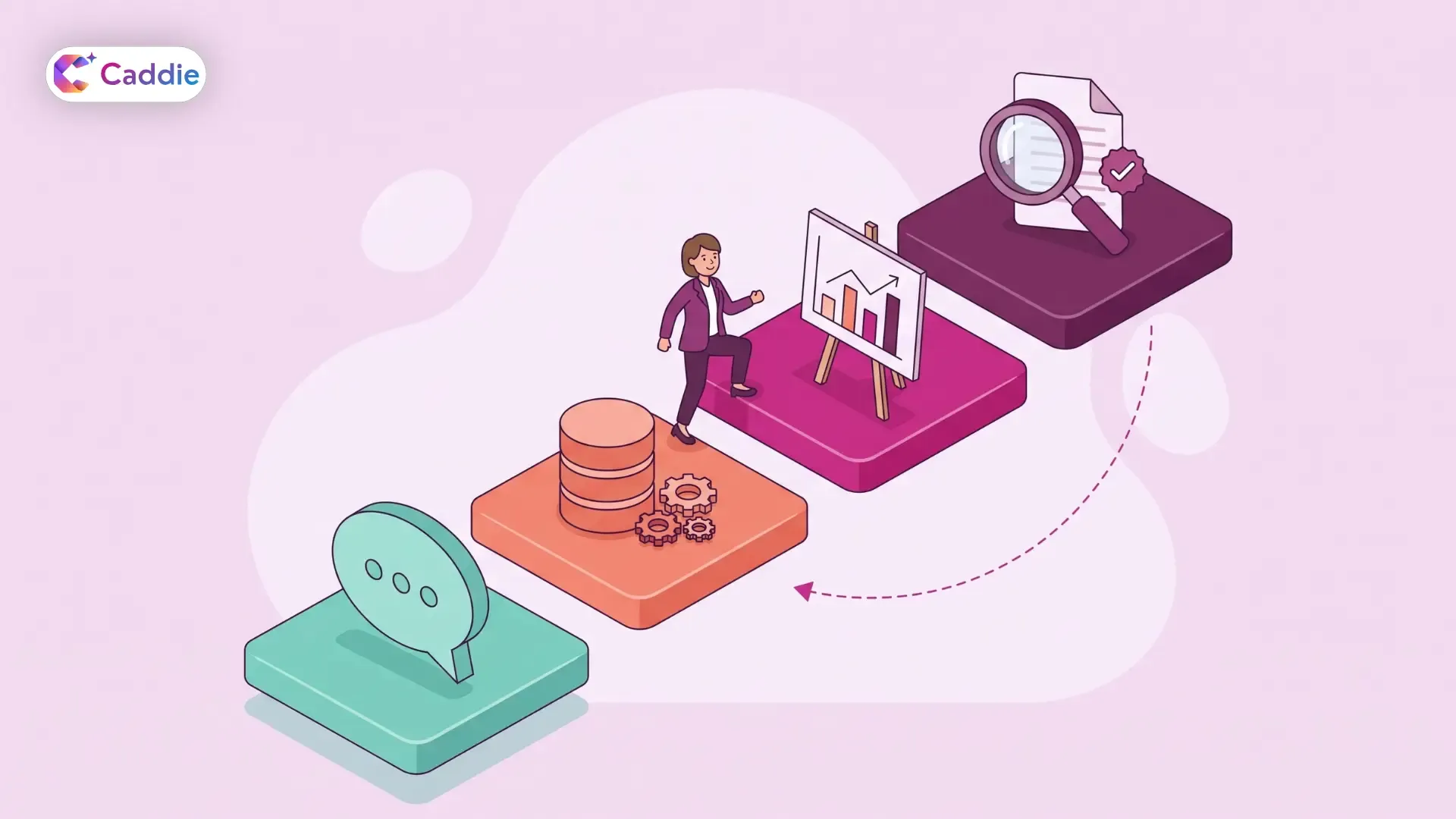
Under the hood, AI for data visualization follows a predictable chain. Knowing each step helps you spot where things go right, and where they can quietly go wrong.
1. It Understands Your Question
You type or speak a request in plain English. A natural language query layer maps your words to the right metrics, dimensions, filters, and time ranges.
2. It Retrieves and Calculates
The system pulls the relevant data and performs the math: totals, growth rates, moving averages, or outlier checks. If the math is wrong here, even a beautiful chart will mislead you.
• The Text2Vis benchmark, published at EMNLP 2025, tested 11 models on 1,985 real-world visualization tasks across more than 20 chart types.
• The top performer, GPT-4o, produced code that ran 87% of the time but matched the correct answer only 42% of the time, for a final pass rate of 26%.
3. It Picks and Builds the Chart
The model chooses a visual that fits the question, such as a line for trends, bars for comparisons, or a scatter plot for relationships, and then generates it.
4. It Explains and Refines
The best AI data visualization tools add a short written summary and let you keep asking follow-ups. Feedback loops matter here.
• In the same study, adding a critic step that reviewed the answer and code raised GPT-4o's pass rate from 26% to 42%.
• GPT-4o also passed 50% of conversational, multi-turn tasks versus 20% of single-shot queries, which suggests follow-up questions help the model stay grounded.
The Business Impact of AI-Driven Insights
So what do you actually get when insight generation speeds up? Mostly time and better-informed decisions, with revenue gains still catching up.
• Two-thirds (66%) of organizations report productivity and efficiency gains from AI, according to Deloitte's State of AI in the Enterprise 2026 survey of 3,235 senior leaders.
• 53% say AI is already enhancing insights and decision-making, the second most common benefit reported.
• Only 20% are currently increasing revenue through AI, while 74% hope to do so in the future.
• Worker access to AI rose by 50% in 2025, so more of your colleagues now have AI tools in hand.
In practice, this is the core promise of decision intelligence: you get from question to evidence faster, while people still own the judgment call.
Where AI Data Visualization Still Falls Short
AI can make a chart in seconds. Making sure the chart is right is still your job. Keep these limits in mind before you act on any AI-generated dashboard.
• Misleading charts fool the models too: The Misleading ChartQA benchmark tested 24 multimodal models on 3,026 deceptive charts. Most scored around 40%, and the best reached only about 50%, compared with roughly 90% on standard chart benchmarks.
• Scale tricks are the hardest to catch: Manipulated axes and scales produced the lowest accuracy of any category in that study, at 36.53%.
• Models rarely say "I can't answer that": In the Text2Vis study, GPT-4o passed just 3% of unanswerable queries, compared with 29% of answerable ones.
• Autonomy without validation is a risk: Gartner names over-reliance on autonomous actions without sufficient validation as the overarching risk for perceptive, GenAI-powered analytics.
• Governance is lagging: Only one in five companies has a mature governance model for autonomous AI agents, Deloitte reports.
The fix is not to avoid AI. It is to pair it with clear metric definitions, role-based access, and strong data governance, so every answer traces back to trusted data.
What to Look for in AI Data Visualization Tools
Plenty of AI tools for data visualization look great on clean sample data. Your real data is rarely that tidy. Use this checklist to separate a polished demo from a tool your teams can trust.
• Answer transparency: Can you see the fields, filters, and logic behind every chart? If not, you cannot verify it.
• Follow-up support: The research above suggests multi-turn conversations improve results, so look for tools built around dialogue, not one-off prompts.
• Honest refusals: A good tool tells you when your data cannot answer the question instead of inventing a chart.
• Sensible chart defaults: Check that axes start where they should and that chart types match the question.
• Structured and unstructured coverage: Many business answers sit in PDFs, policies, and spreadsheets, not just databases.
• Enterprise security: Role-based access, SSO, and MFA should control who sees what, inside every generated chart.
• Shareability: Insights only matter if they reach the people who decide, so look for easy export and sharing.
If you are comparing options, our guide on choosing an enterprise AI assistant covers the evaluation in more depth.
See Your Data Clearly With Caddie
Caddie, the enterprise AI assistant from VividMinds, helps you turn business questions into clear visual answers. Ask in plain language across your databases, documents, and spreadsheets, and Caddie returns interactive charts, tables, and clear answers in seconds. Keep asking follow-ups to dig deeper, then share findings by email or WhatsApp or export them to PDF or Excel. Role-based access, SSO, and MFA keep every answer within the right permissions. Your team stays in control of the decision while Caddie does the digging.
Book a Caddie demo and see what your own data has been trying to tell you.
Frequently Asked Questions
What is AI data visualization?
AI data visualization uses machine learning and language models to turn data into charts and plain-language explanations. You ask a question, and the tool picks fields, calculates results, and builds visuals.
How accurate are AI-generated charts?
Accuracy varies. In the EMNLP 2025 Text2Vis benchmark, GPT-4o's final pass rate was 26%, rising to 42% with a review step. Always check the logic before acting on important charts.
What should enterprises look for in AI data visualization tools?
Look for tools that explain their logic, support follow-up questions, admit when data cannot answer a question, cover structured and unstructured sources, and enforce role-based access, SSO, and MFA.
Can AI data visualization replace data analysts?
No. AI speeds up chart building and first-pass analysis, but people still define metrics, validate logic, and make decisions. Gartner flags over-reliance on unvalidated autonomous actions as a key risk.
How does generative AI for data visualization help business users?
It lets you ask questions in plain English instead of building charts. Over 50% of analytics and AI leaders say their organizations already use AI for automated insights and natural language queries.